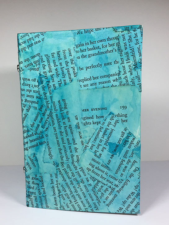
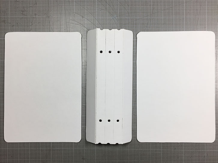
On Saturday I attended a class given by Regina Portscheller, in which we created ring binder art journals.
We made the binders from scratch, building them up from book board, collaging and painting the cover and attaching the ring mechanism.
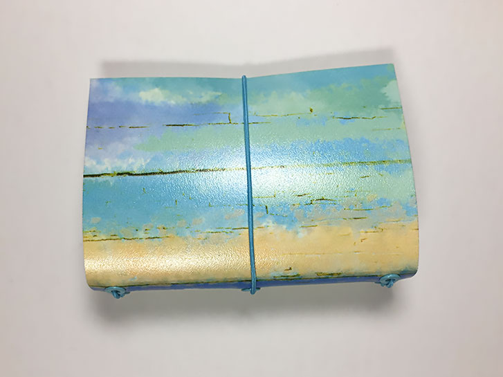
I am making a book about Mermaids, so I chose to paint my cover a watery aqua color.
The inside of the cover is also collaged and painted just like the outside.
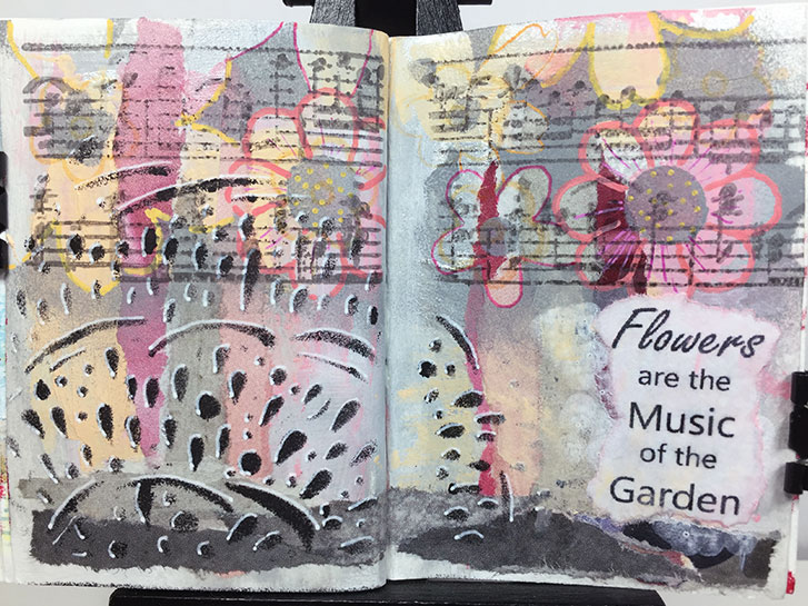
This was a struggle. I loved the underlying colors (you can’t see the silver, but it is there,) and design. I loved the flowers and the black design on the left.
And then a period of time went by, and I tried to finish this last night so I could post it for today.
You know what? That’s not a good reason to make art.
I have lost the flow, I’m tired now.
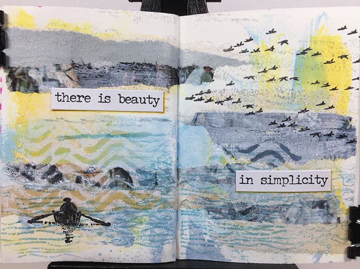
As I was creating the background for this layout, I had nothing specific in mind for finishing it. I just liked the soothing, calm colors.
I got to the point where I felt it was finished, but I didn’t know what to add for a focal point. So I went window shopping in the stamp cabinet. I was drawn to the rowing person. To me, it also was calm and serene.
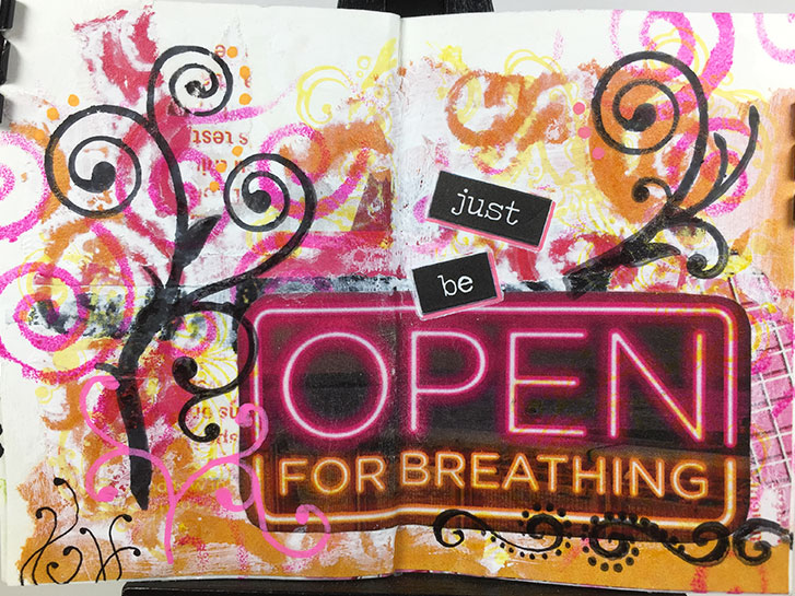
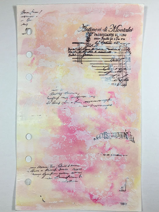
I found this sign in the magazine that I was tearing up to make these pages. I loved the colors and the shapes of the letters. So I cut it out, not having a total plan in mind at the time.
Yesterday, I was looking at it, and I also found scraps of papers with the pink and orange colors, so I decided to make this page.
In particular, I wanted strong, swirly shapes that reminded me of air, and breathing.
Sometimes it’s hard to know when to stop. This one almost got away from me.
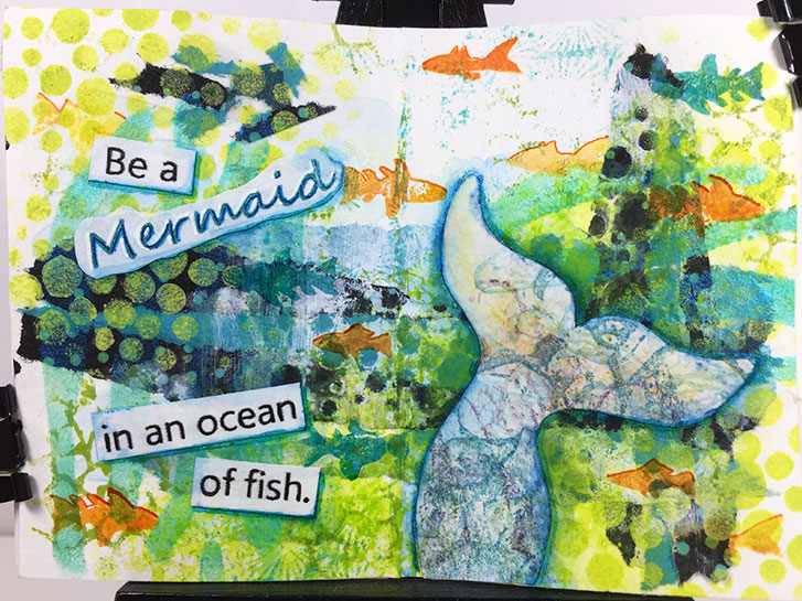
I am making a larger Mermaid book, so I thought I would turn this page into a tiny version of one of the quotes.
It didn’t originally start with that in mind. Originally, I was going with the influence of dots and circles.
But the colors were so watery looking, I just went for it.
I am definitly falling in love with this style. I’m considering doing it on a larger scale when I finish this month’s self-challenge!
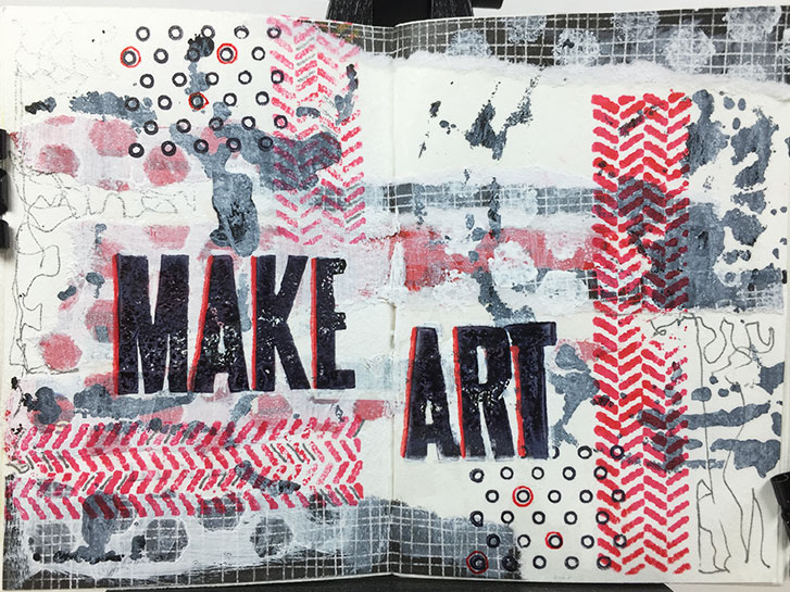
This started with some red strips torn from a magazine advertisement. I decided to add some strips of black scrapbook paper with a check pattern.
At that point I made the decision to go with black, white and red only to see if I could make it work.
Another spready in my tiny, Traveler’s Notebook art journal. This one uses the same materials as yesterday. However, it turned out to be more of a challenge.
I am enjoying the process of these. But now I’m wishing for more pen colors. I may have to switch to acrylic paint to get what I envision!
#microart #microartjournal #miniatureartjournal #miniartjournal #miniatureart #tinyjournalnation #allthingstiny #allthingsminiature #microartjournaling #tinyartjournal #travelersnotebook
I haven’t posted any pictures from my tiny TN art journals in a while, so I thought I would show you the one I did yesterday. The materials used here are torn design paper, matte medium, Posca pens, stamps, Archival ink, metallic gel pens and regular gel pen.
This is a fairly simple technique that creates a big impact. I am really happy with the way it came out.
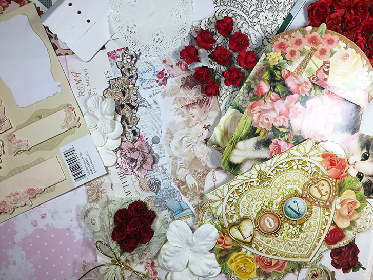
I showed you the cover portion of the book I’m working on in yesterday’s post. Today, I’m gathering up things from around the studio that I think I will use on the inside and to decorate the cover.
I’m sure you’re getting the idea of the theme, here: roses. And I’m going with an old fashioned theme. So this sets my colors to pinks, reds, tans and browns with some accents of green, yellow and gold.
I recently replaced my antique, red, Sizzix Big Shot with a new Sizzix Big Shot Plus . I wanted to use embossing folders, but my old Big Shot didn’t have a crank, so you had to press, lift, move item, press, lift, move item, etc. It really wasn’t working well for what I was trying to do. In addition, I wanted to use some larger pieces of paper, cardstock and bigger dies.
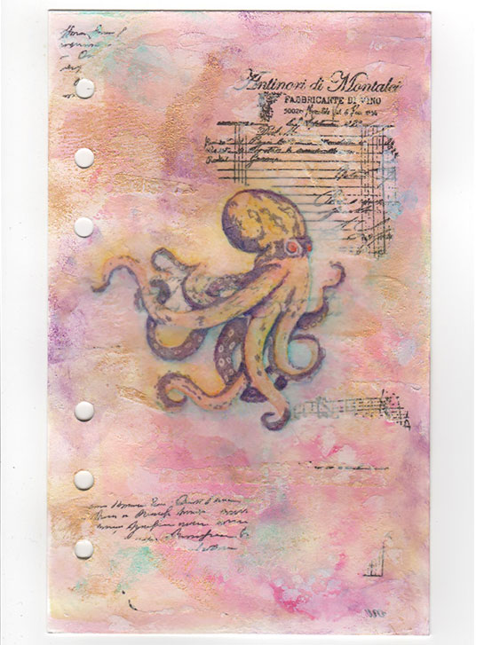
On Friday, I posted a version of this page from my 3-ring art journal. I thought I was finished, but I wanted to look at it for a couple of days because something felt unfinished about it.
I decided to add some more to the lower third of the page. Nothing obtrusive, I didn’t want anything to vie with the octopus that is the focal point. It just needed something to balance it out.
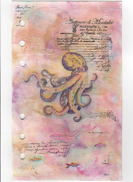
Yesterday, you saw a partially finished page from my 6-ring journal. This is the same page, and I think I’m finished… or almost?
I needed a focal point for the page, so I added the octopus stamp. I actually previewed it with the octopus in various positions, but I finally settled on this one. It seemed to want to be tucked into the torn corner of a piece that was already on the page.
I thought you might like to see what I am doing with some of that stamped paper I showed you yesterday.
This is a WIP. There are multiple layers here. But what I loved was the way the paper that was stamped on disappears into the piece, leaving behind just the black, stamped image. Liquitex Matte Medium was used as glue.
Even though this was one of the first tiny Traveler’s Notebooks that I made, I never wrote a post about it. So now’s the time, since some people are looking for easy, simply way’s to make a cover for their tiny art journals.
This was made from a piece of an inexpensive, plastic placemat. You can find these at dollar stores, walmart, and some grocery stores. They are in the kitchen section.
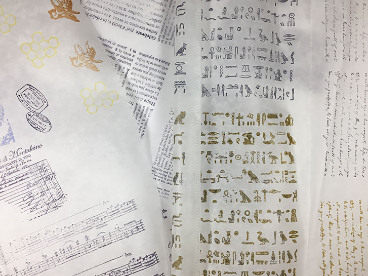
I am busy creating my own “designer tissue”. It’s really simple and easy. I am stamping on deli paper!
This is a great project when your time is limited, or your having an artistic down day.
Use Archival ink, and any stamps that you think will look good torn or cut out and applied to your artwork. I generally stick to text and texture and neutral colors. But sometimes I have a plan in mind, and then use specific images and brighter inks.
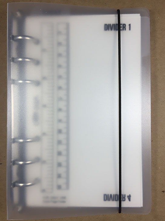
I’ve been thinking about how to create an art journal, one page at a time. But how would I keep the pages together, before they were permanently bound?
Last week, when I was window shopping on Amazon (yep, I do that!) I ran across this A6 size, 6-ring binder . It had a translucent cover with an elastic cord to hold it shut. And it came with some zip pockets and card holder sheets.
If you saw yesterday’s post, you will understand what is going on here. I had a few more “museum” pictures.
The main outcome of this exercise, for me, has been the desire to do some larger pieces. They won’t be completely Zentangle… rather influenced by it.
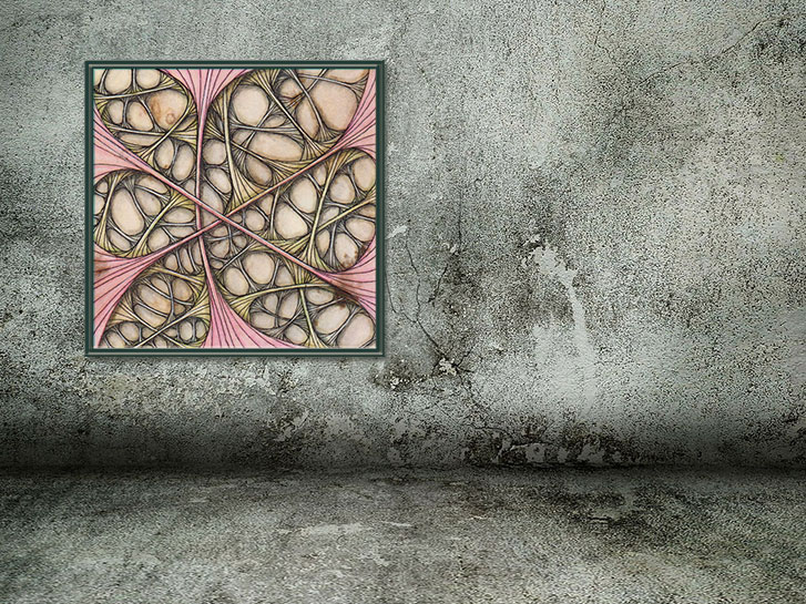
Above, this tile is a monotangle of Ruutz . It is using the idea of fractalizing a tangle, introduced by Eni Oken , in one of her Art Club classes.
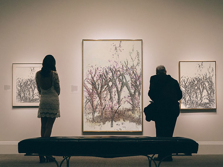
Recently, a friend of mine posted an image of her art in a museum setting. The picture was stunning. She used an app to create the image.
I decided to see what was out there for doing this sort of thing, and I came across PhotoFunia , which is a website that let’s you choose a setting, and then upload your photo to see how it looks.
I used it to created the image above, which was the stamped art that I posted yesterday.
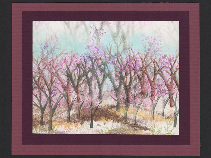
We often use stamps to add to our art journal page, but have you ever tried to create an entire painting using only stamps to apply ink to the paper?
This is one of my favorite techniques for creating a scene: using multiple stamps and stamping ink to build the image, layer by layer.
It’s a bit tricky, and requires a bit of thinking and some planning. If you were to try this, what scene would you create?
It’s been a long time (over two years, actually!) since I posted any of the pages in this Teesha Moore style art journal. I had kind of gotten stuck because I didn’t know what materials to use to get the effect that I wanted.
I pulled this book out yesterday because I was looking for things to work on and get ideas for on a art play date. I thought this book might be a good subject.